Typography · Case study · 2026
Constructa Solid Font Design
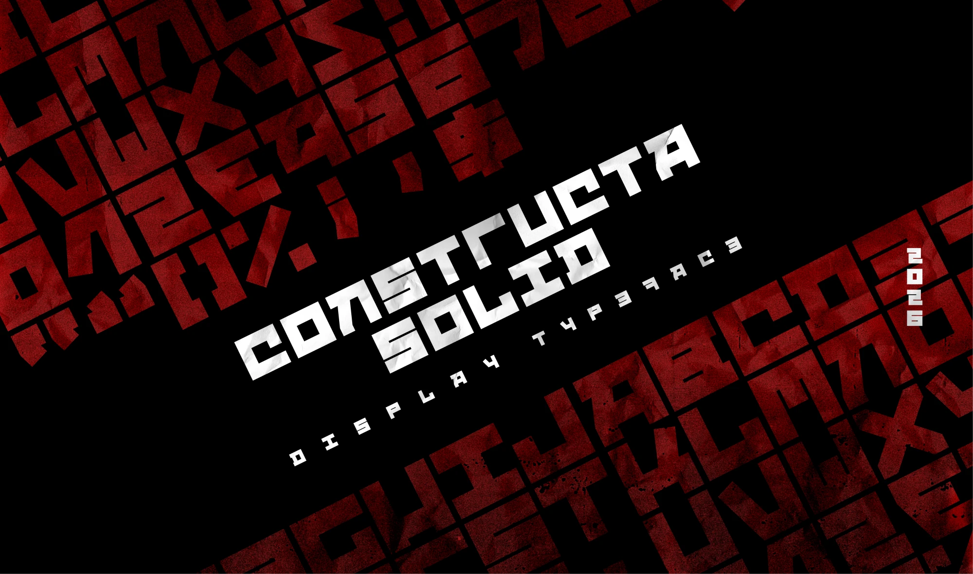
A display typeface inspired by the visual language and compositional energy of Russian Constructivism.
- Role
- Type Designer
- Year
- 2026
- Scope
- Display typeface
- Category
- Typography
- Tools
- Hand sketches / Figma
[Overview]
A display typeface built for expressive compositions
Design of a Display Typeface Inspired by Russian Constructivism
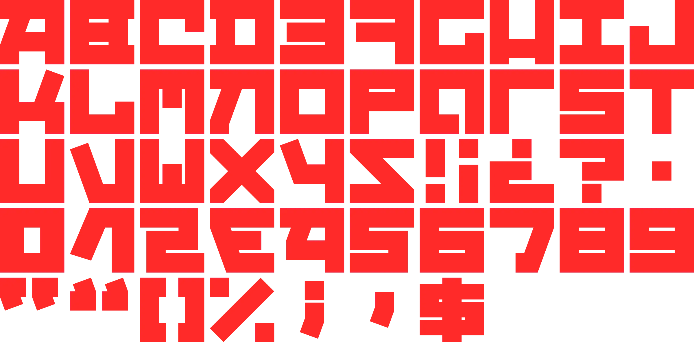
Constructa Solid is a display typeface developed from the visual language of Russian Constructivism. The project draws inspiration from its geometric compositions, its propagandistic power, and the use of typography as an active part of the image.
The goal was to design an alphabet with a recognizable identity, capable of taking center stage in headlines, posters, covers, and editorial pieces.

[The Starting Point]
The Starting Point
Russian Constructivism utilized geometric shapes, diagonals, strong contrasts, and compositions with great visual tension. The letters occupied the space, organized the reading experience, and contributed to the message. That principle became the foundation of the project.
Constructo Solid was conceived as a typeface with a physical presence. Its characters are constructed from compact blocks, straight edges, pronounced diagonals, and minimal counterforms. The result is an expressive typographic system, closer to a graphic tool than to a typeface intended for long blocks of text.
[System Development]
System development
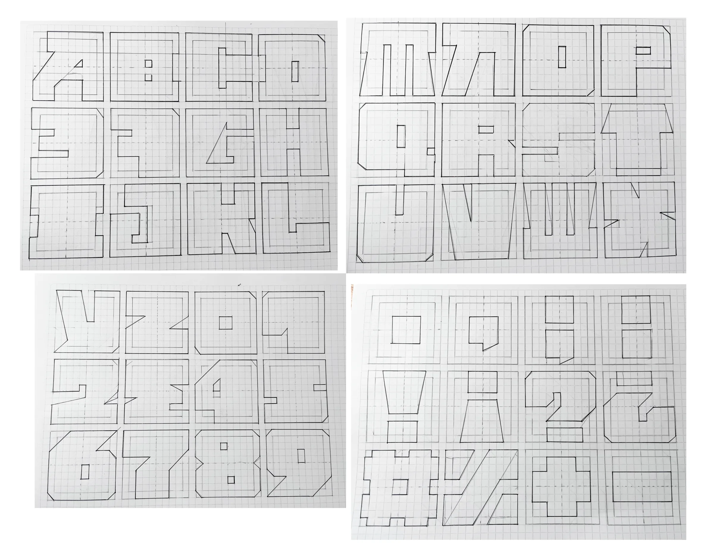
The alphabet was developed by hand, exploring the relationship between geometry, weight, and legibility. The main formal decisions included the use of solid, compact structures; a predominance of straight and diagonal lines; minimal contrast between strokes; small, controlled counterforms; angular terminations; variable proportions to maintain expressiveness; simplification of curves through geometric solutions; and recognizable silhouettes.