Editorial design · Case study · 2026
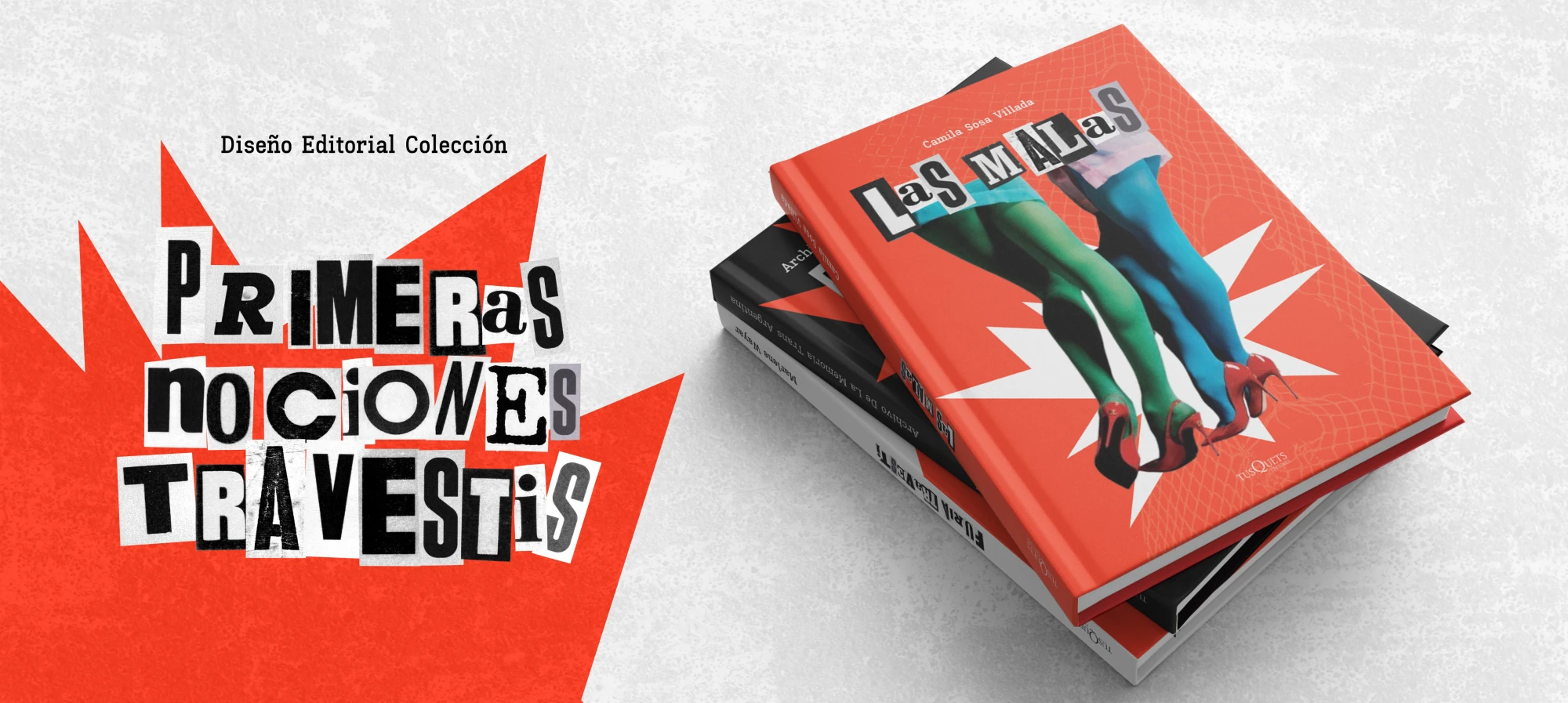
Book Collection: Primeras Nociones Travestis
- Year
- 2026
- Category
- Editorial design
- Tools
- Figma / InDesign
[Overview]
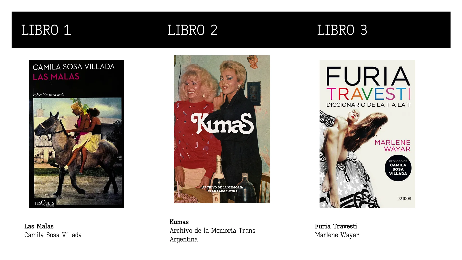
Primeras Nociones Travestis is an editorial collection composed of three works: Las malas, Kumas, and Furia travesti. The project proposes a reading journey that begins in a fantastical register, continues through first-person narratives, and culminates in a more defiant voice.
The collection explores the constant tension between sweetness and roughness, vulnerability and resistance, as part of the same experience.
[The concept]
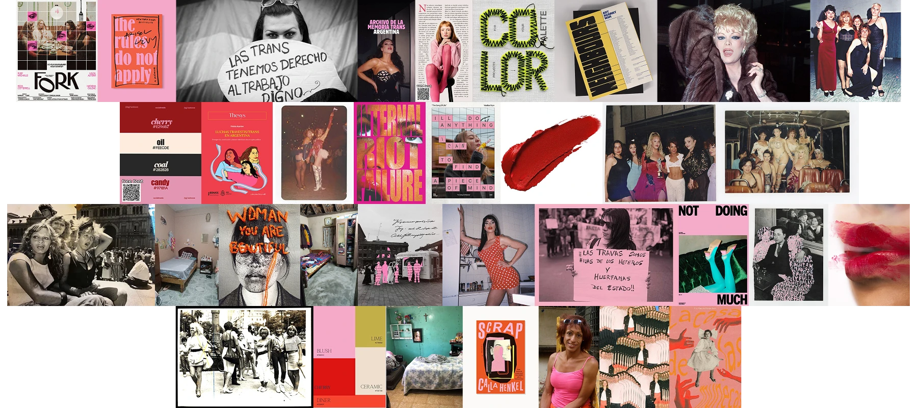
The concept
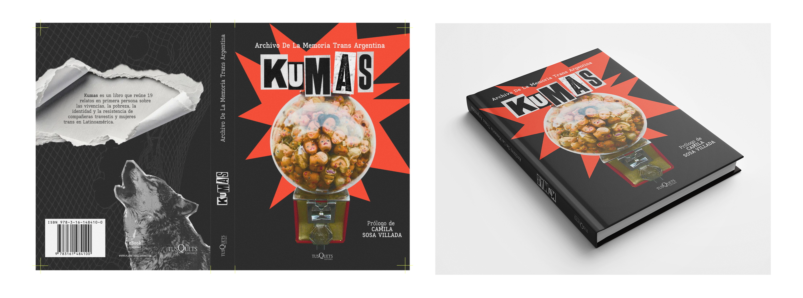
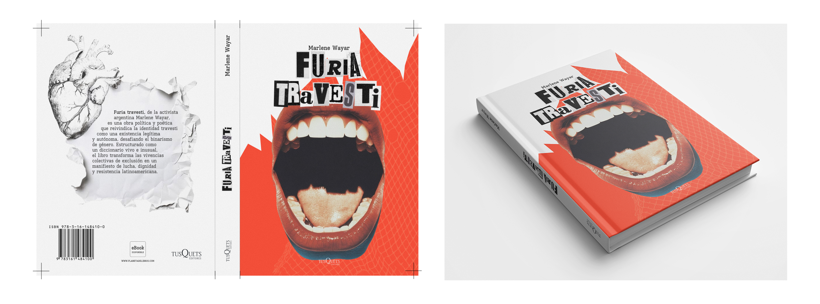
The visual concept emerges from the connection between the travesti universe and punk culture. Both are built from the margins, challenge established norms, and turn identity into a form of presence. From this relationship, I developed a raw, expressive, and deliberately imperfect graphic language. The system draws on elements of punk aesthetics such as collage, layering, strong contrasts, analog textures, and fragmented compositions: visual approaches associated with independent production. The goal was to represent dissidence without reducing it to predictable symbols. What has historically been labeled as excess, error, or difference becomes the center of the visual proposal.
[Collection system]
Collection system
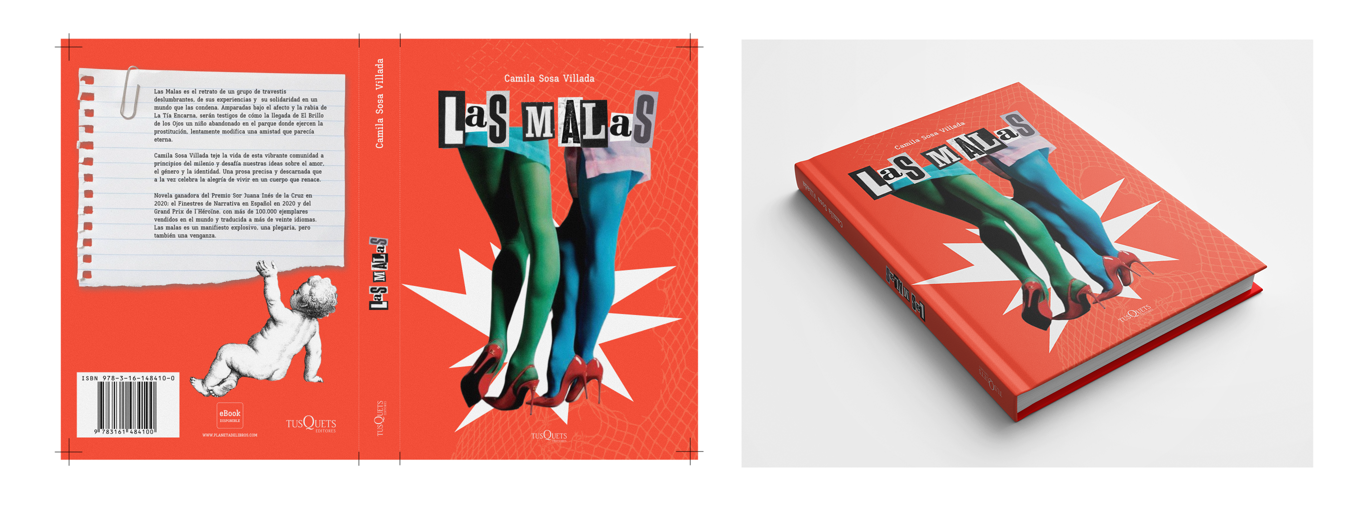
Each book maintains its own identity through color, imagery, and graphic elements, while sharing a recognizable structure with the rest of the collection through a common palette of red, black, and white; high-impact central compositions; photographic cutouts combined with illustrations; angular geometric shapes; expressive, slightly irregular titles; and a consistent arrangement of the spine and editorial information.
This combination allows each work to be recognized as an independent piece and, at the same time, as part of a whole.
[Interior design]
Interior design
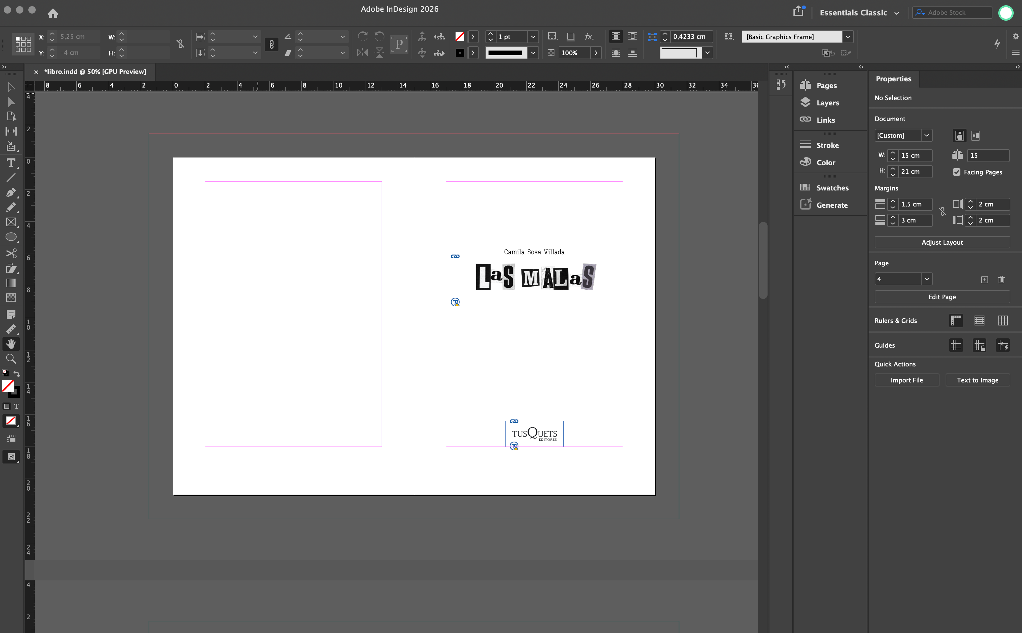
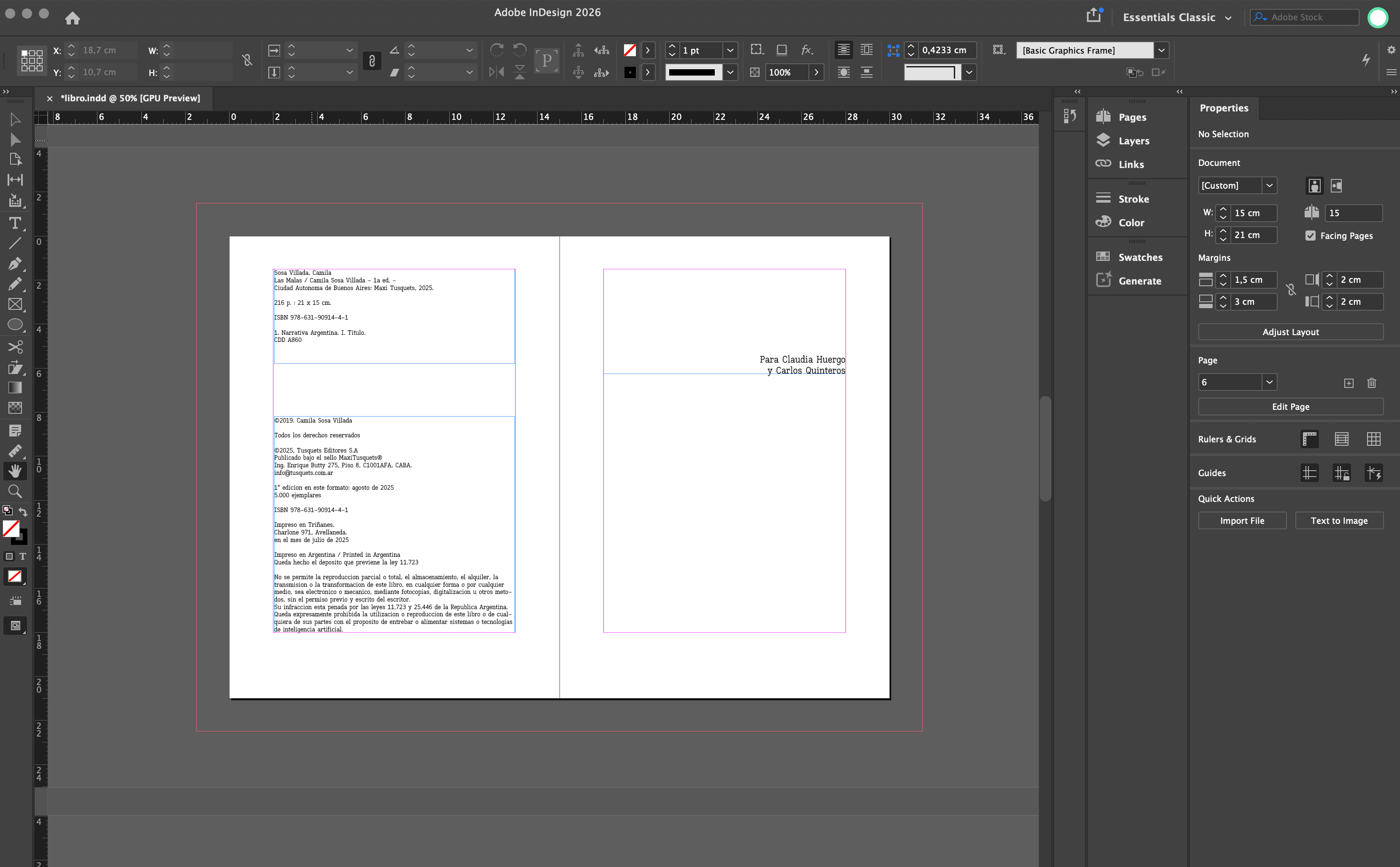
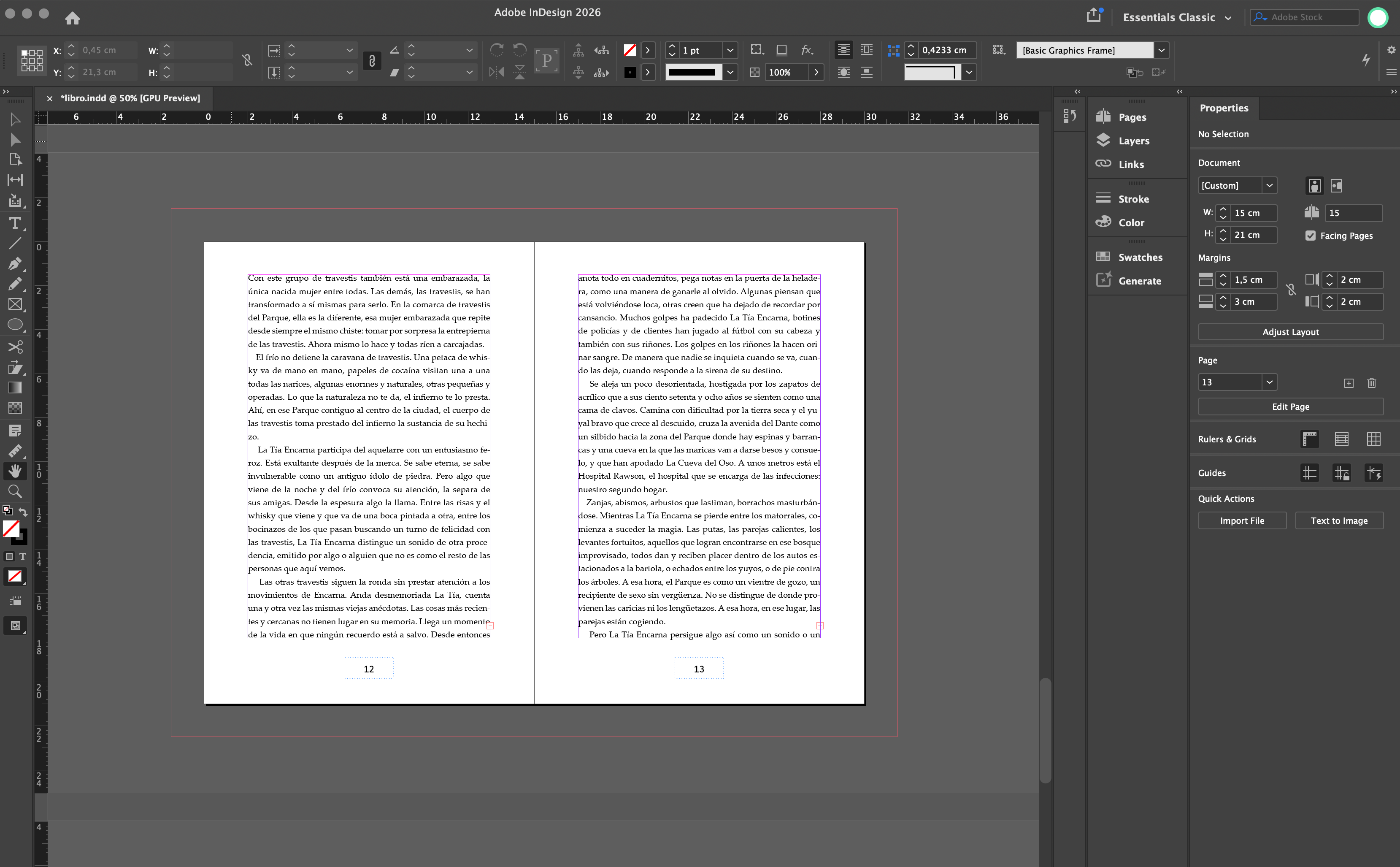
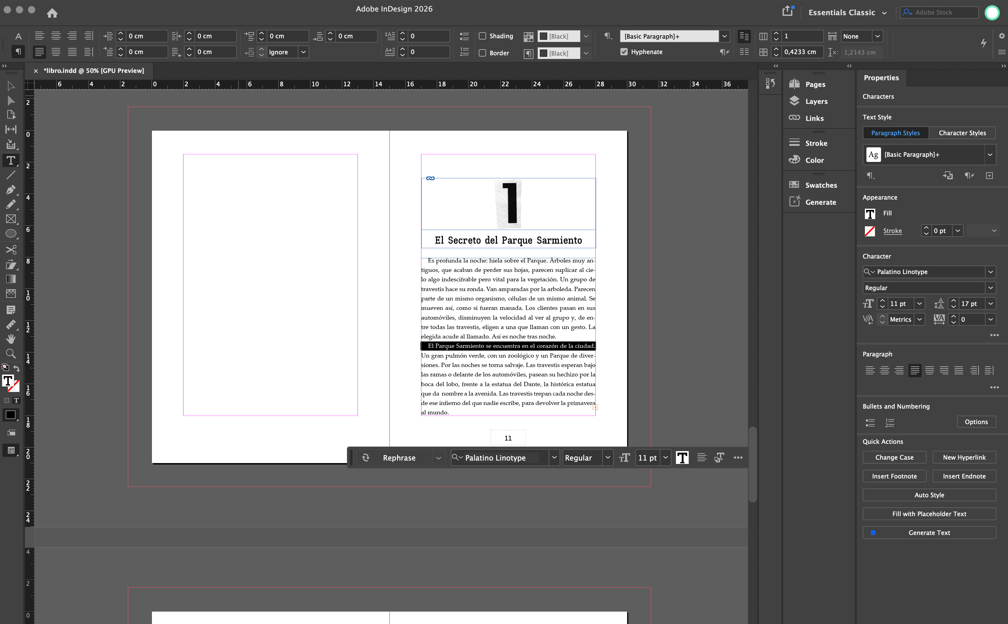
For the interior, I worked with a 15 × 21 cm format and a modular grid capable of supporting extended reading without losing its connection to the exterior visual system. Palatino Regular, used for the body text at 11 pt with 17 pt leading, provides legibility and a more classic editorial tone. Kay Pho Du, with its old typewriter character, adds another analog element to the project. The preliminary pages maintain a restrained composition with ample white space. This decision creates a contrast with the intensity of the covers and supports a gradual entry into each work.
[Endpapers]
Endpapers
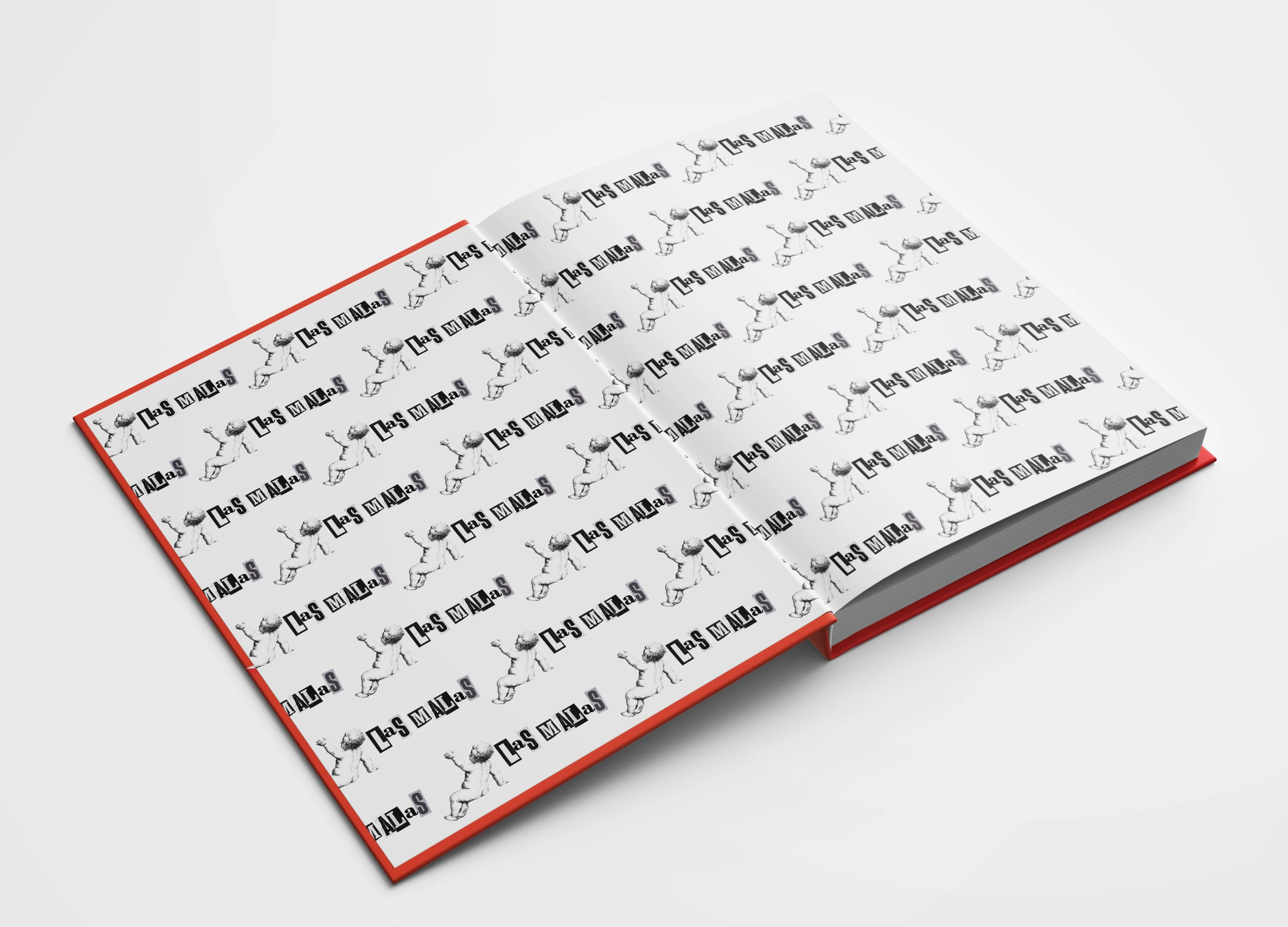
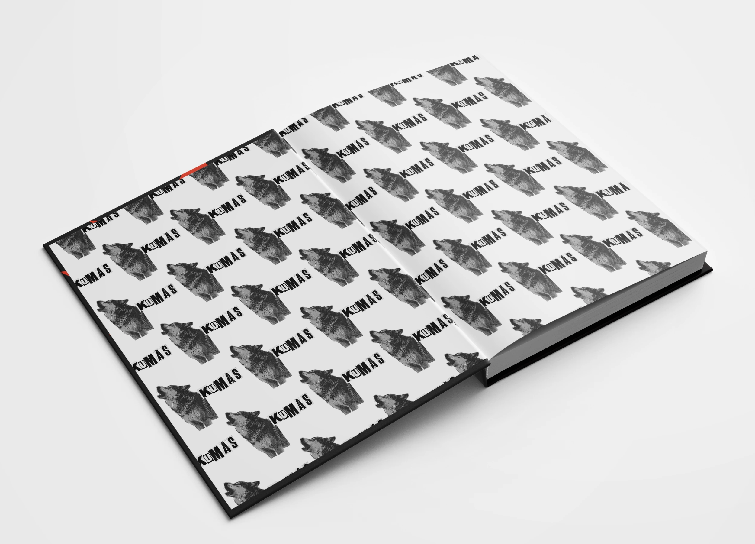
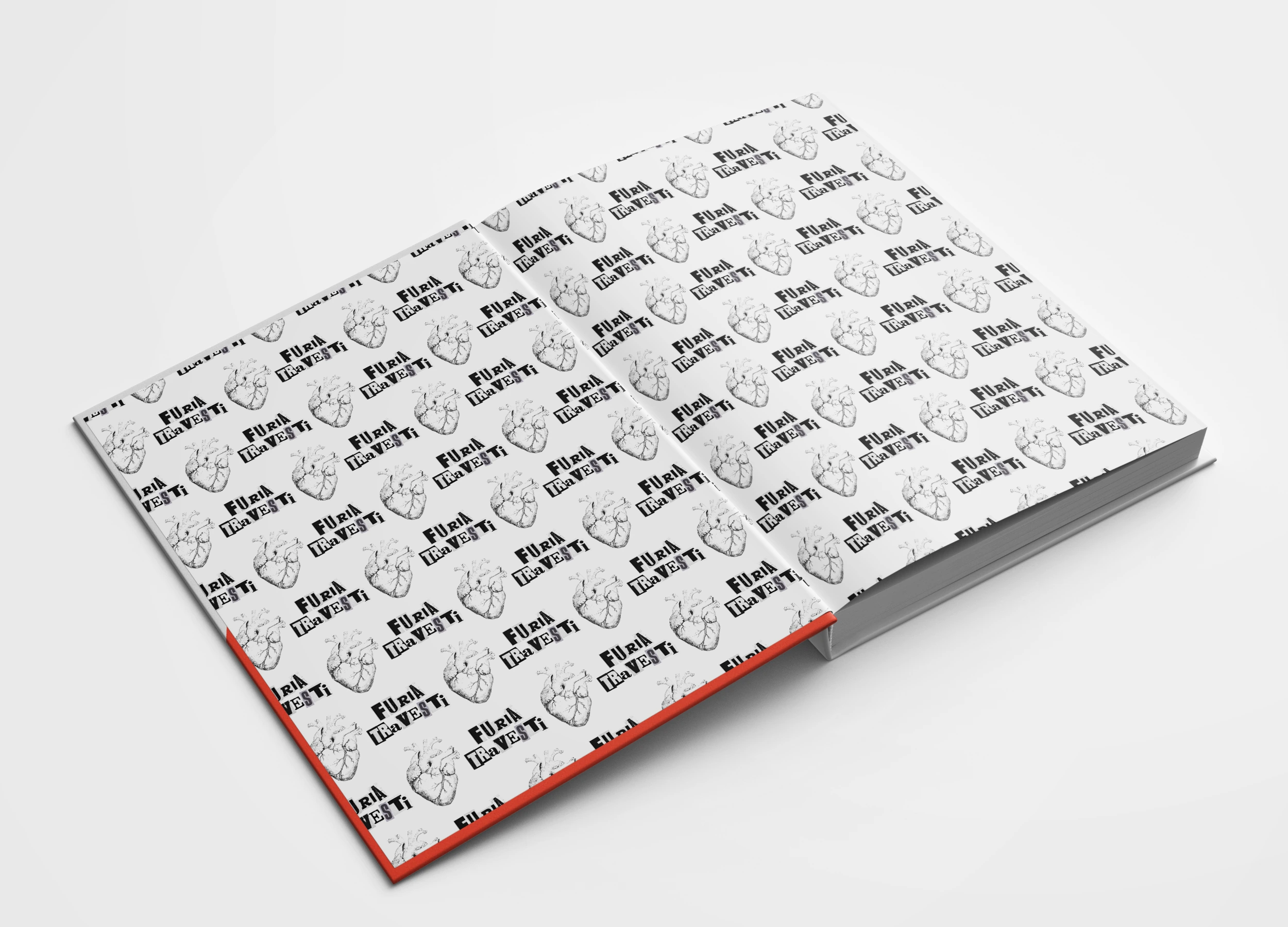
The patterns and illustrations are tailored to each book's identity, making the act of opening it a visual experience in its own right. They serve as a transition from the collection's outer expression to the reading space.
[Container]
Container
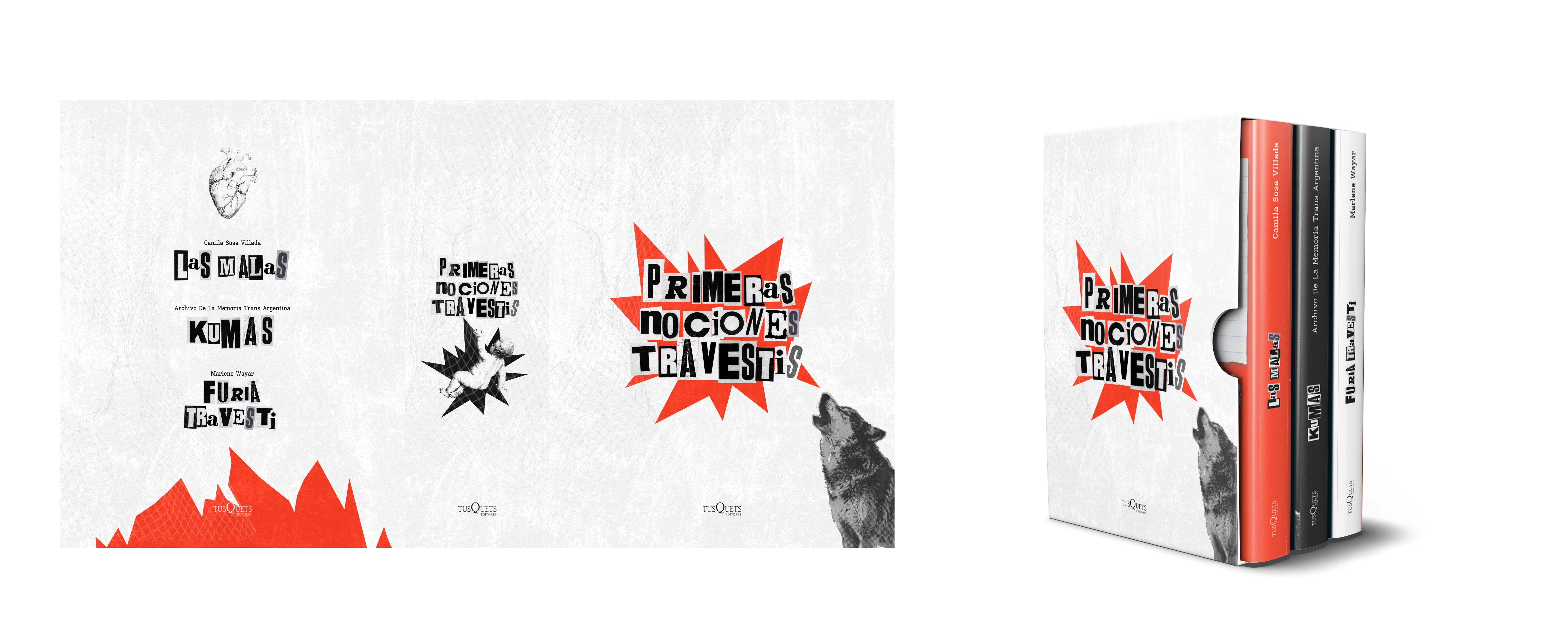
The collection is completed by a container that brings together the three volumes. Its design draws on the palette, textures, and overall typographic language.
[Result]
Result
Primeras Nociones Travestis builds a shared identity for three works with different registers. The project brings together covers, interiors, endpapers, and container through a flexible system capable of preserving the singularity of each book.
The result is a direct collection, uncomfortable at times and marked by tension. A proposal in which imperfection, appropriation, and dissidence function as central design decisions.